
As part of designing and building the MediaView360.com Information Products we need a way to have a human in the loop for matching Content Titles.
The Problem
The problem to be solved is that we collect data from multiple platforms and multiple publishers, and the Content Titles don’t align, so being able to show a single measurement number for a piece of content is a challenge.
For example the Content Titles used for Shortland Street on Linear are often slightly different to the Content Titles used for Shortland Street on Video on Demand.
When we get to YouTube then the problem get a lot bigger, content publishers want to be able to tweak the titles they use to try and increase engagement and reach, but we always need to know which funded content those YouTube videos relate to.
The Blueprint
As we build this out we always start with a light architectural Blueprint so that Nigel and I are on the same page and talking about the same things. (we call this our agile-tecture sessions)
For this one we ended up with 5 pattern components we cared about:
Matching Engine
(AutomatedAI)
The Pattern(s) that create the suggested matches for Content TitlesMatching Store
(Operational Context)
The place we store those suggested matchesHuman in the Loop
(AssistedAI)
The interface that allows a Human to be in the loop and approve/decline/pass the suggested matchMastering Policy
(Business Context)
The place where we store those human matching decisions as policiesMastering Execution
(Business Context and Code)
The business logic that applies those matching decisions in a repeatable way every time we collect or consume the data
Experimenting with Agility
We tend to work on these architectural components in parallel as a decision for one will often impact the decision for another.
And we will often discover something we haven’t thought about that means we end up needed an additional component or two.
For example what we decide for #2 and #4 impacts what we build for #3.
We can use a relational physical data model or a graph model and we can use Spanner, Spanner Graph, BigQuery, BigQuery Graph. These decisions impact what we build for #3.
But also the design of #3 will also impact teh choices we make for #2 and #4.
In the past we had awesome humans help us prototype our app, Chris did the awesome Design and Richard did the awesome Build. Nigel had of course automated the Deploy.
The challenge was the cost of change. It reduced our agility.
So I have been experimenting with the use of Claude Design and then Claude Code to see if we can reduce the time and cost of those experimentation loops.
My Claude Design Process
Here is the process I go though using the Human in the Loop #3 component above as the example.
1 - Pattern Storming ideas, the Town Plan
The first thing I do is give it some light instructions on the intent of the app and then ask for 10 options.
We have to create a sceen that a;lows people to accept or delince matches of core concepts like Customers, Suppliers, Porudcts or COntent Titles.
A back end process will crate the match candidates.
this screen will show tthe potential matches.
the user then needs ro accept, decline or delay the match.
We shouls gamify the process in the acreen to give the user a sense of acheivement eaxh tiome thwy complete a match and start to cleare the screen.
Give me 10 options for this screen
As you can see I don’t worry about spelling etc.
Claude Design came back with this:
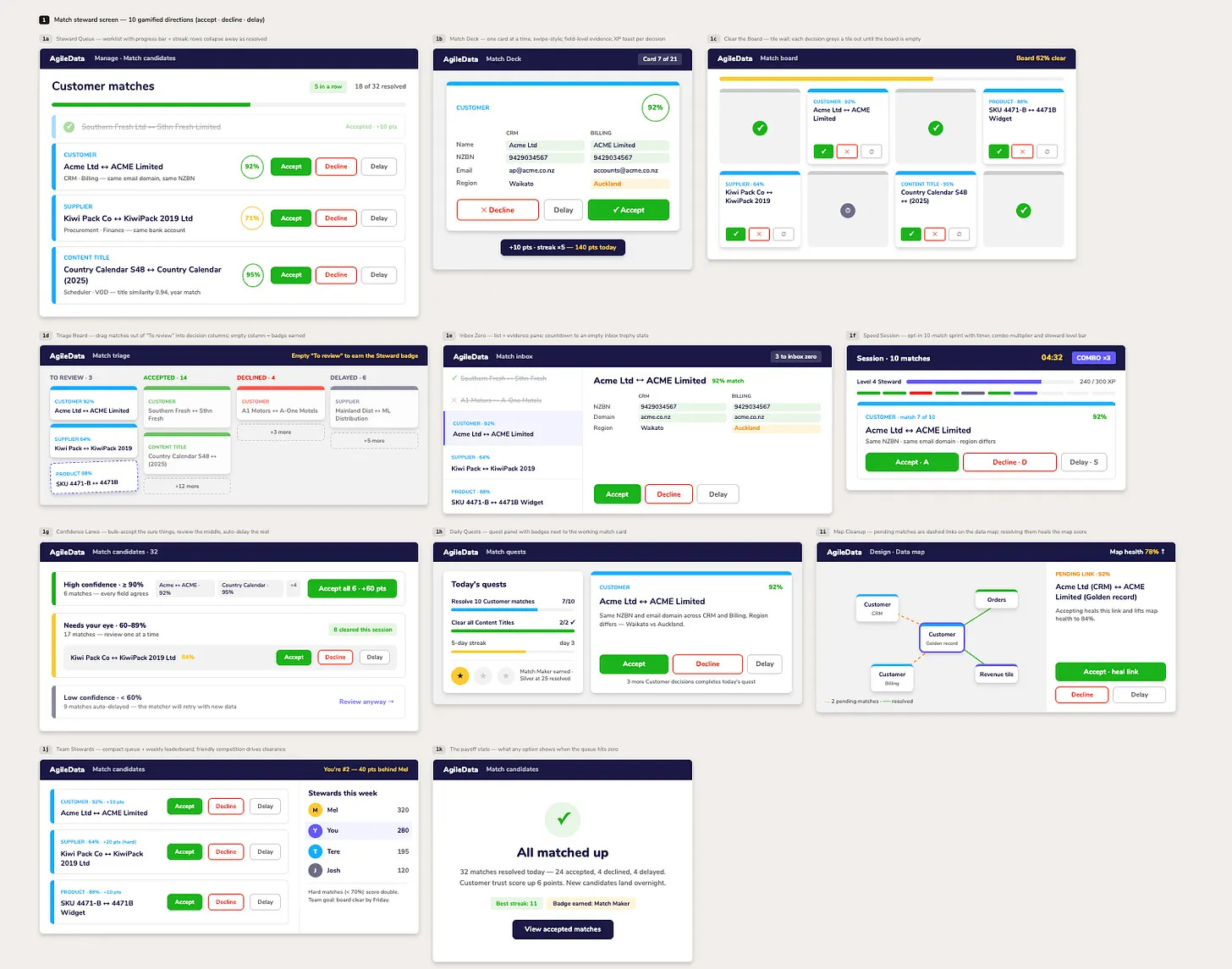
10 directions (plus the shared “all clear” payoff state as 1k), all accept / decline / delay, each with a different gamification hook:
1a Steward Queue — progress bar + streak, rows collapse away
1b Match Deck — one card at a time, XP toast per swipe
1c Clear the Board — tile wall that greys out as you go
1d Triage Board — drag to decision columns, badge for emptying
1e Inbox Zero — countdown to an empty inbox
1f Speed Session — timed 10-match sprint, combo + level bar
1g Confidence Lanes — bulk-accept the sure things
1h Daily Quests — quest checklist + badges
1i Map Cleanup — resolving matches heals the data map score
1j Team Leaderboard — friendly competition
Tell me which to build out as a working prototype, or mix elements (e.g. 1a + 1h’s quests).
What I am doing in this step is looking for UI design ideas.
I always have an idea of what I think these screens will look like before I start the design process and how they will flow. But often Claude Design will come up with a UI or UX pattern I hadn’t thought of, and I then get it to help me rift with those ideas to see if they have legs or not.
2 - Explore the possible Houses on the Street
Next I step back and look at the UI Patterns across all the options. Either one will stand out as the my clear preference and I will start iterating that or I will want to experiment at the higher level, lets call it the town plan level.
In this case I went with the town plan level and so asked for another round.
I thin the left and right things need to be seperate raterh than treated as one thing.
give me 10 more otpions based on that
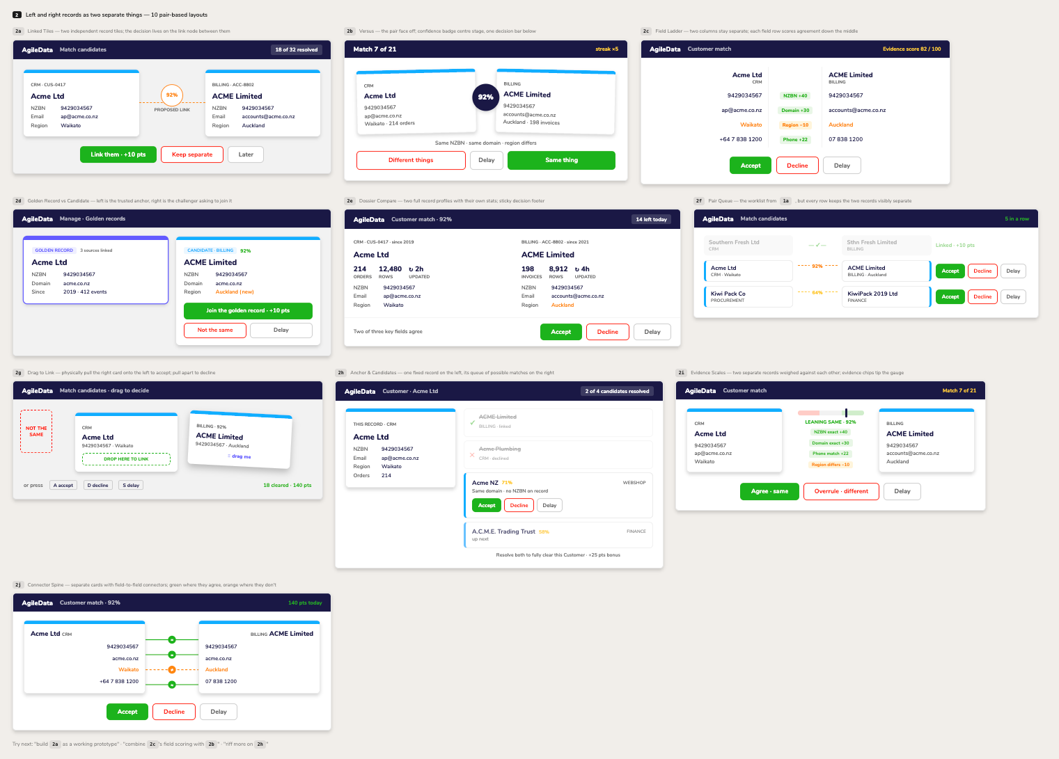
10 new pair-based options in turn 2 (top of the canvas) — the two records are now separate cards in every layout:
2a Linked Tiles — decision lives on the link node between tiles
2b Versus — face-off with centre confidence badge
2c Field Ladder — agreement scored per field down the middle
2d Golden Record vs Candidate — trusted anchor vs challenger
2e Dossier Compare — full profiles with own stats
2f Pair Queue — worklist where each row keeps the pair separate
2g Drag to Link — pull cards together / apart
2h Anchor & Candidates — one record, its candidate queue
2i Evidence Scales — chips tip a same/different gauge
2j Connector Spine — field-to-field connectors, green/orange
Pick one to build out, or mix (e.g. 2a with 2c’s field scoring).
If you have seen any of the designs in our AgileData UI you will see how Claude Design is re-using the “tile card” component from our Design System for these iterations.
While I love reusing that design component, i’m not sure it fits well for this use case. So we need to iterate that.
3 & 4 - Design the Rooms in the House
One of the things I love about Claude Design os the way it numbers each option. So it allows me to say, take this bit from 2b and this bit from 2d and then give me new versions
It also allows me to add comments to specific parts of each option and then get it to generate new versions based on those comments.
In this flow I did both.
I wanted to focus on one Component and validate it is what we want, so first I picked a specific option and asked for a new version of it.
Focusing on the design of one room in the house so to speak.
gie me this as another design option
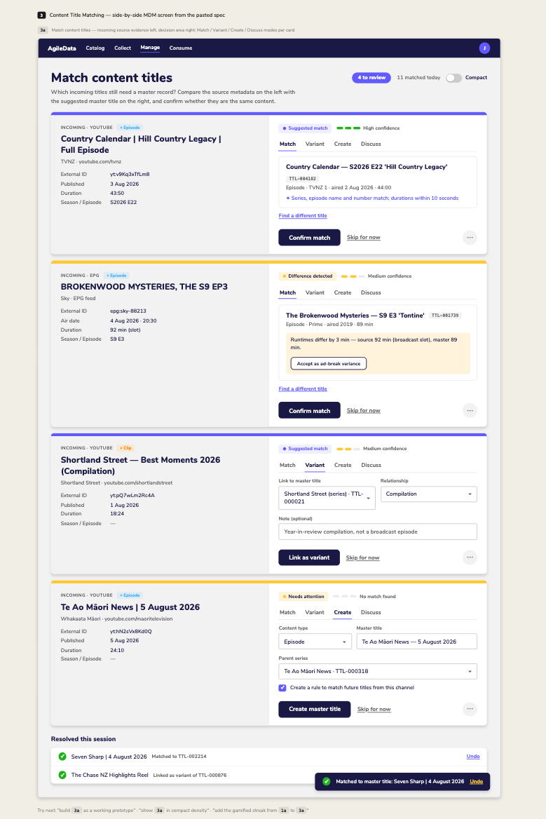
Added as 3a at the top of the canvas — the full Content Title Matching screen from the spec: header with count pill + Compact toggle, four cards (high-confidence match, runtime difference with ad-break variance action, Variant mode, Create mode), each with source evidence left / decision area right, Match·Variant·Create·Discuss tabs, "Resolved this session" list and an undo toast. Say the word to build it as a working prototype with live tabs, confirm animations and queue behaviour.
It still wasn’t quite want I wanted so back to designing all the rooms again.
This time I provided more guidance using comments. This allows me to tag comments about different parts of the options, highlight the bits I liked and want to keep and the bits I don’t like and don’t want reused.
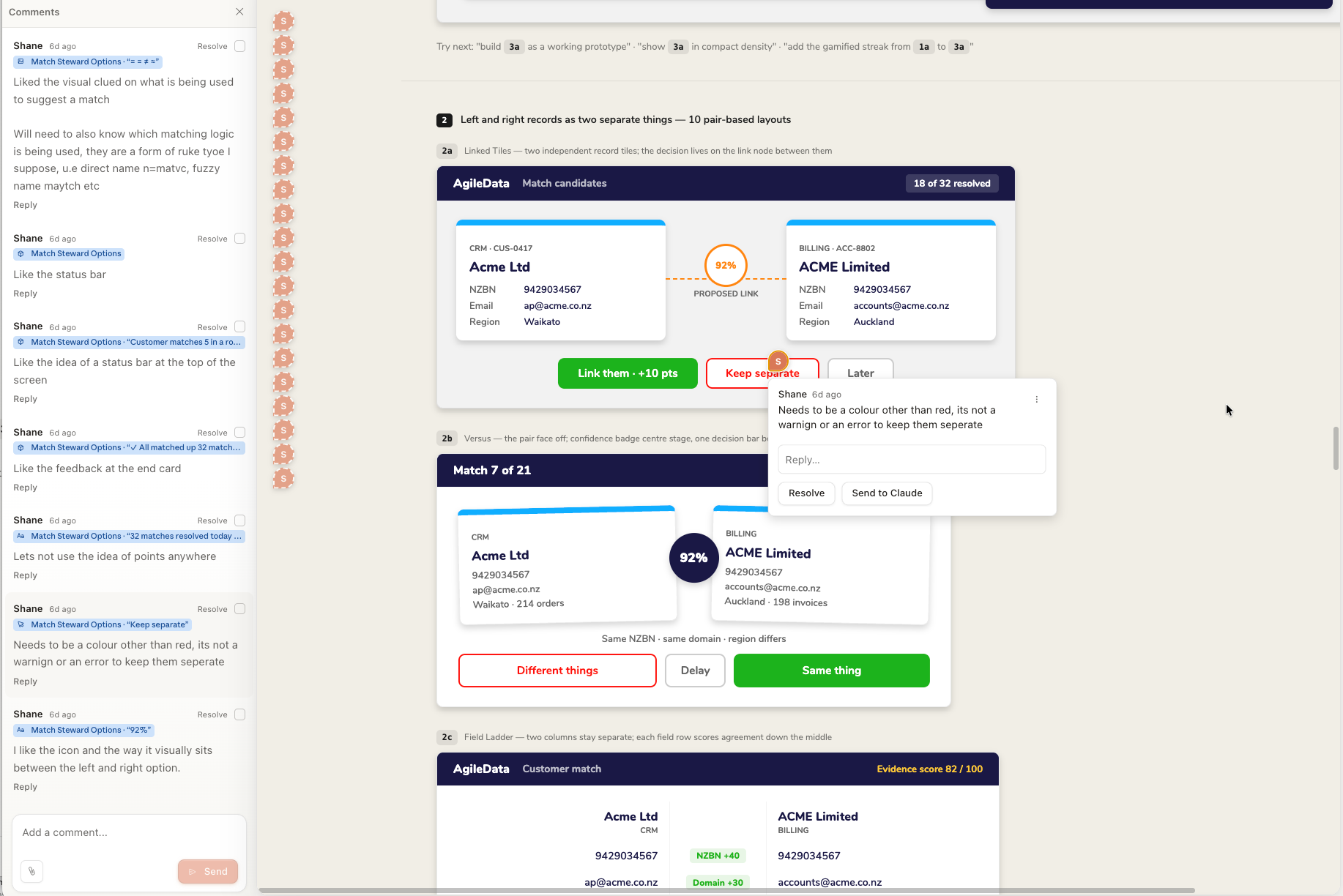
all my feedback is on comments, give me 10 more optins to review
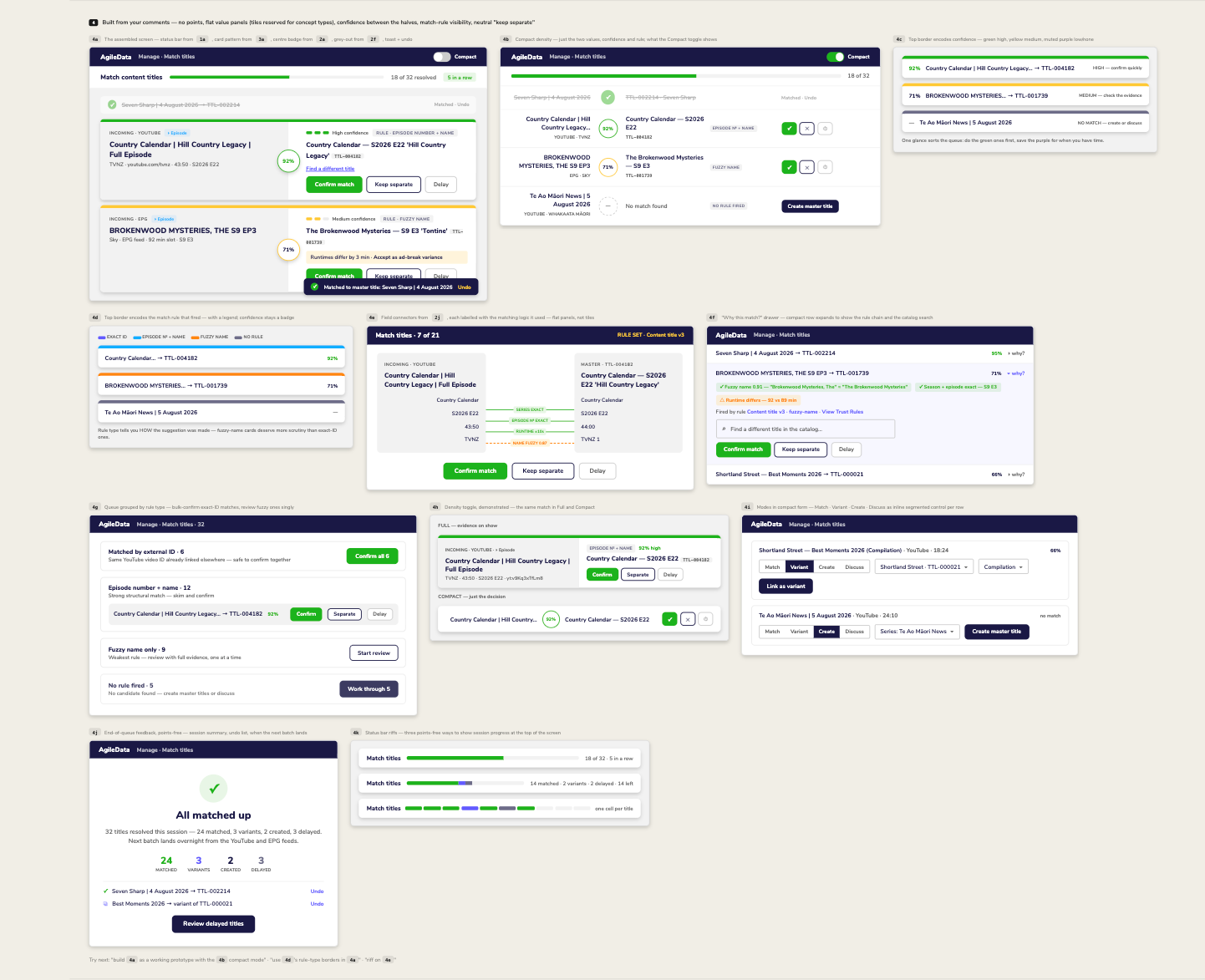
Turn 4 is up top — 11 riffs built straight from your comments. Applied throughout: no points, records as flat value panels (tiles stay reserved for concept types), “Keep separate” in neutral Purple Rain instead of red, confidence badge sitting between the halves, and match-rule visibility.
4a the assembled screen (status bar + 3a card + centre badge + grey-out + undo toast)
4b compact density — the minimal view your Compact comment described
4c / 4d top border encoding: confidence vs match-rule type (with legend)
4e field connectors labelled with the rule logic (fuzzy 0.87, exact, ±10s)
4f “why this match?” expandable rule-chain drawer + catalog search
4g queue grouped by rule type, bulk-confirm exact IDs
4h Full vs Compact of the same card
4i Match/Variant/Create/Discuss as inline segmented control
4j points-free end-of-queue summary
4k three status-bar treatments
Comment on what sticks and I’ll converge, or ask for a working prototype of the winner.
5 - Design the flow between the Rooms in the House
Once I think I have an idea of the moving parts, I start to refine each one.
In this round I want to focus on the different flows through the screens depending on the Matching Pattern that was used to selected the recommended match.
I want to be clear to the Human in the loop which matches are pretty confident and which require more curation.
another version based on the comments, Just one version of the screen on reach of its proess states
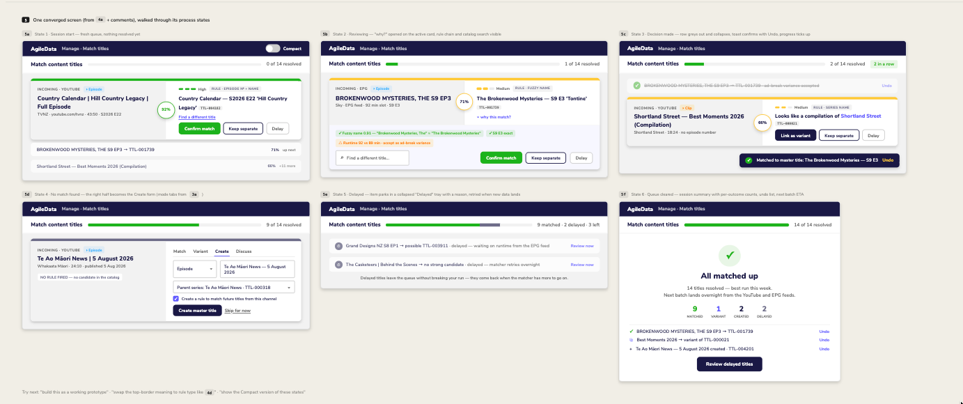
Turn 5 is at the top — one converged design walked through its six process states:
5a session start — fresh queue, active card + up-next rows
5b reviewing — “why this match?” rule chain + catalog search open
5c decision made — grey/strike collapse, undo toast, streak ticks
5d no match — right half becomes the Create form
5e delayed — parked tray with reasons, retried when data lands
5f queue cleared — per-outcome counts, undo list, next batch ETA
Everything honours your comments: no points, flat value panels, neutral “Keep separate”, confidence badge between the halves, rule chips visible. Comment on the states or say “build it” for a working prototype.
6 - And back to the Furniture in a Room
Once I ham happy we have the high level flow of the screens sorted, then I start to focus on the detail.
This time I want to return to focussing on the components within the match that provide the context for the recommended match.
I can’t quite decide how I want those to look, so rather than specific instructions for that part of the design, its back to the “give me 10 ideas” pattern storming
I like the lines in 4e, they allow me to quickly see what wws used fo rth ematch.
give me a 10 versions of 5b based on the that use the line desing from 4e
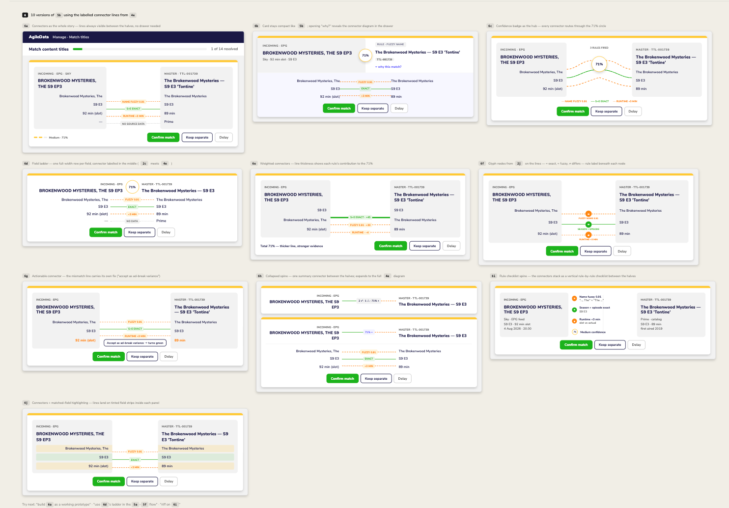
Turn 6 at the top — 10 versions of 5b, all built on 4e’s labelled connector lines (green solid = exact, orange dashed = fuzzy/differs):
6a connectors always visible, no drawer
6b compact 5b card; connectors appear in the “why?” drawer
6c badge as hub — lines route through the 71% circle
6d field ladder — full-width row per field, label mid-line
6e weighted lines — thickness = contribution (+45, +30, −4)
6f glyph nodes (= ≈ ≠) with rule labels beneath
6g actionable connector — mismatch line carries its own fix
6h collapsed one-line spine that expands to the full diagram
6i vertical rule checklist between the halves
6j lines land on tinted field strips inside each panel
Comment on the keepers and I’ll fold the winner into the 5a–5f state flow, or say “build it”.
7 - Iterate a specific item of Furniture
I like 6c but want the grey / white option with no gapsfrom 6b
Added 7a at the top: 6c’s hub — curved connectors meeting at the 71% badge — laid over 6b’s gapless grey/white card, with the badge sitting on the seam and a rule-line legend in the footer beside the actions.
iterate 7
Make the cirlce kpi in between the rtwo titles
and oick up the matching lines from 6a
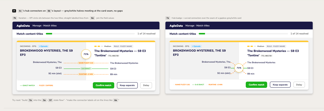
Added 7b next to 7a: the 71% circle now sits between the two titles on the seam, and the field values are joined by 6a’s straight labelled lines (green solid exact, orange dashed fuzzy/differs) spanning the gap.
8 - Time for the Human
I could keep going iterating this way for ever, but I would quickly hit the diminishing returns anti-pattern.
Plus the closer I get to supposed Done Done, the less likely the people who will validate these screen designs will feel like they can can provide feedback or suggest changes.
So now its time to create a prototype app they can try and see what they like, dislike and hate.
7b it is
7b it is — building it as the working prototype.
Built Match Titles Prototype.dc.html — a working version of 7b:
6-title queue (incl. a no-match item that switches to “Create master title”)
Confirm / Keep separate / Delay all live, with undo from the toast or the resolved list
Progress bar, streak chip (points-free), up-next rows, delayed tray with “Review now”, and the all-clear summary when the queue empties
Tweaks: legend and streak chip can be toggled off
Click through a few decisions to feel the flow; the options canvas is still there for reference.
Claude Design creates an prototype you can click though. Haven’t tried that in anger as a way of getting feedback, so keen to give that a try and will report back later.
Mature Design System
One of the gifts we have is Chris our Designer was fastidious on creating a Design System for all the UI components he designed.
This was in Figma and we were able to import that from Figma into Claude Design, as the basis of the design system for prototyping.
I think that saved us a lot of time and effort in the initial setup.
Claude Design will still ignore some of the design system components, specifically fonts for some reason, so I always have to reinforce for Claude Code that its to use the Prototype designs as the ideas not the spec and it must reuse the AgileData App Design System when its creating new screens for our AgileData App UI.
Define Once, Reuse Often (DORO)
One of the things I keep in mind throughout this design process is reuse.
This series of screens will be used for more than just matching Content Titles, we will use it to help match Customers, Suppliers, Products etc for other AgileData Information Products for other customers.
But I don’t want to over engineering it right now, so I focus on the use case in front of me.
That is a bit of a balancing act.
Next Steps
Next I will get feedback from the key stakeholders on how they find this design based on the Claude Design interactive prototype.
And I will share it with Nigel as context for our conversations on what we are going to do for the other moving parts,
The key being this was a minimal investment in time and effort to get this far, and so the cost of change is low.
Its the value we get from this AssistedAI pattern.
And that give us agility to iterate this as much as we need to.
Information Product Canvas Workshop
“That’s not what I wanted.”
“But that’s what you asked for.”
Shane runs a 6 hour workshop on the Information Product Canvas, a repeatable way to gather data requirements in 30 minutes. The approach he actually uses with stakeholders, not a textbook version that falls apart on contact with messy data and vague requirements.
He runs it regularly.
Latest dates : Gather data requirements in 30 minutes using a shared language
Workshop details : https://maven.com/agiledataguides/info-prod